Efficient Responsive Viewport Testing Tool
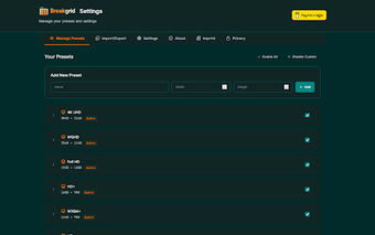
Breakgrid is a browser extension designed for developers and designers, facilitating quick testing of responsive websites. It allows users to resize their browser window to common viewport sizes with just a click, streamlining the development process. Key features include predefined presets for various devices, custom preset creation, and a favorites system for easy access to frequently used sizes. Additionally, users can quickly resize using keyboard shortcuts and manage presets efficiently with drag and drop functionality.
The extension boasts a modern design with dark/light mode options, a clean interface, and smooth animations for enhanced user experience. It supports multiple languages and prioritizes user privacy by ensuring no personal data is collected or transmitted. Built with TypeScript and modern web technologies, Breakgrid offers a fast and reliable solution for responsive design testing.